Overview - A re-design of the John Lewis checkout making it a fully responsive experience.
My role - UI design and branding.
The old John Lewis checkout presented a number of challenges including usability issues, dated visual design and a poor experience on mobile devices. We were tasked with creating a fully responsive platform that provides an effortless checkout journey for all customers and devices.
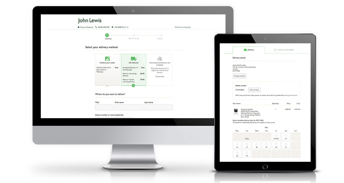
I came on board at the start of the project during shaping to establish ways of working that lend themselves to responsive design. A mobile first design approach was adopted to tackle the more challenging smaller screens.
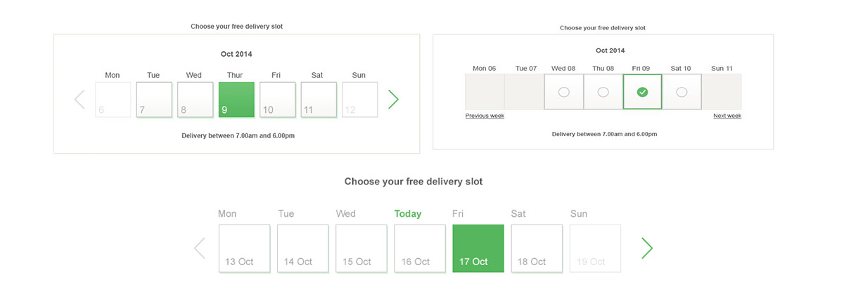
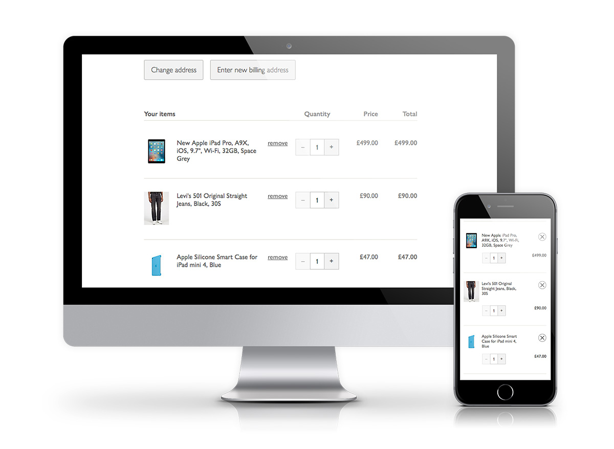
6-up sketching sessions were used to create design patterns for interactions that scale up to larger screens. Chunky buttons and input fields were designed to be touch friendly for mobile devices. Tables were designed to maximize the screen space to show important order information. Calendar based grids were created for simple delivery date selection.
Weekly user testing sessions were held to iterate design interactions and prototypes. Prototypes were created in Axure and then tested using the John Lewis customer lab. This offered us the opportunity to view the prototypes being used by customers in user focused scenarios.
Extensive QA was done to make sure everything worked on the most popular devices used by John Lewis customers. Accessibility testing was done using screen readers JAWS and Voice Over to ensure the checkout was accessible to users with visibility challenges.
NatWest Broker Portal